The stand-up that didn’t add up
The test report looked clean.
- 1,000 samples, zero errors
- Average response time: 88 ms
- Throughput above target
- Every SLO check marked PASS
I attached the HTML report to the stand-up thread. Someone from product replied within an hour:
“Users are still complaining about checkout feeling slow. Did we actually test the right thing?”
That question stuck with me — not because the test was wrong, but because the summary was incomplete. We had answered “did we hit our thresholds?” without answering “would a real user feel this is fast?”
This is the first entry in Field Notes — short, practical write-ups from real perf work. No theory decks. Just patterns I keep seeing in the wild, with numbers attached.
What the average is hiding
Latency is not one number. It’s a distribution.
When JMeter (or any APM tool) reports average response time, it’s collapsing thousands of data points into a single figure that overweights fast responses and underweights slow ones.
Consider three requests to the same endpoint:
| Request | Latency |
|---|---|
| 1 | 40 ms |
| 2 | 42 ms |
| 3 | 400 ms |
Average: 161 ms. Two users had a great experience. One waited nearly half a second. The average tells you almost nothing about who suffered.
Now scale that to 1,000 samples — the size of a typical smoke or regression run — and ask: how many slow responses are acceptable?
If your SLO says p99 under 500 ms, you’re saying: “At most 1% of requests may exceed 500 ms.” That’s a precise, user-facing contract. An average of 88 ms says nothing about whether you kept that contract.
When every check passed — and the tail still screamed
I ran a validation test against five public APIs — Postman Echo, JSONPlaceholder, DummyJSON, PokeAPI — with explicit SLO thresholds: p99 under 500 ms, 99% success rate, 25 req/s throughput.
All seven SLO checks passed. Zero errors. Throughput at 33 req/s. On paper, a textbook green run.
But the anomaly section told a different story:
| Endpoint | Avg | p99 | Tail ratio (p99 ÷ avg) |
|---|---|---|---|
DummyJSON GET /products/1 | 42 ms | 149 ms | 3.5× |
JSONPlaceholder GET /posts/1 | 43 ms | 145 ms | 3.4× |
PokeAPI GET /api/v2/pokemon/1 | 76 ms | 232 ms | 3.1× |
These weren’t failures. They were MEDIUM-severity anomalies — the kind of signal that separates a perf engineer who stops at “all green” from one who asks “green for whom?”
If your stakeholders only see the banner, they assume the experience is uniformly fast. They’re not wrong to push back when real users disagree.
Why production feels slower than your lab
Lab conditions lie kindly. Production does not.
| Lab assumption | Production reality |
|---|---|
| Warm caches | Cold starts after deploys, autoscaling events |
| Single region | Users on mobile networks, cross-region routing |
| Steady load ramp | Traffic spikes, flash sales, retry amplification |
| Happy-path endpoints | Auth failures, partial outages, dependency timeouts |
| Aggregate report | One slow shard poisons a slice of users consistently |
The tail isn’t random noise you can average away. It’s often structural — GC pauses, connection pool exhaustion, a single hot partition, N+1 queries that only surface under specific payload sizes.
That’s why I stopped treating p99 as a “nice to have” column and started treating it as a primary release gate.
The scatter chart doesn’t lie
Averages hide clusters. Scatter charts expose them.
On a separate run — three public APIs, 15 virtual users, three minutes — Reveal surfaced a JSONPlaceholder tail where p99 was 19.9× the median. Not a subtle drift. A cliff.
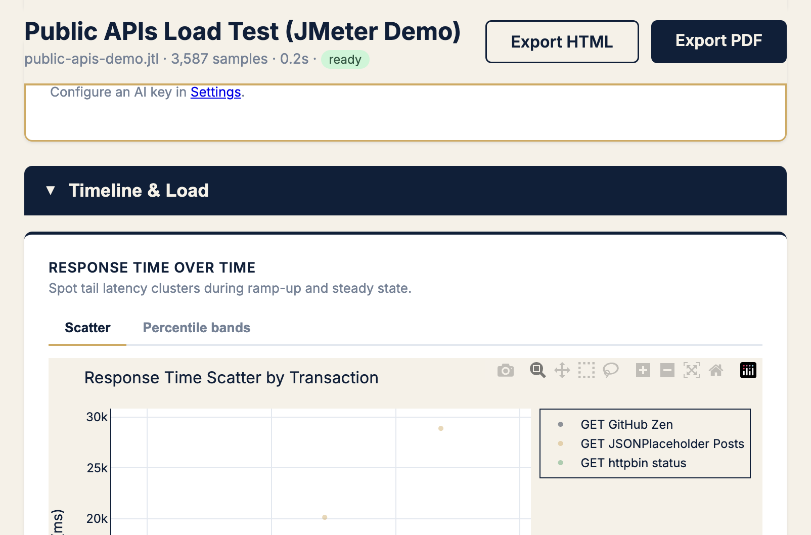
When I see a scatter band with a second cloud sitting above the main cluster, I don’t ask “what’s the average?” I ask:
- Which transaction label owns the upper cloud?
- When did it start — gradual drift or sudden step?
- Is it correlated with errors, throughput drops, or a specific time window?
Those three questions have saved more releases than any spreadsheet pivot.
Apdex: one number that respects the tail
Raw p99 is essential. Apdex (Application Performance Index) adds user-satisfaction framing.
Apdex buckets each response into:
- Satisfied — at or below your “good” threshold (T)
- Tolerating — between T and 4T
- Frustrated — above 4T
Your Apdex score is: (Satisfied + Tolerating/2) / Total
On a run where error rate and latency SLOs both failed, the Apdex gauge made the user-impact story obvious before I wrote a single sentence in the incident doc:
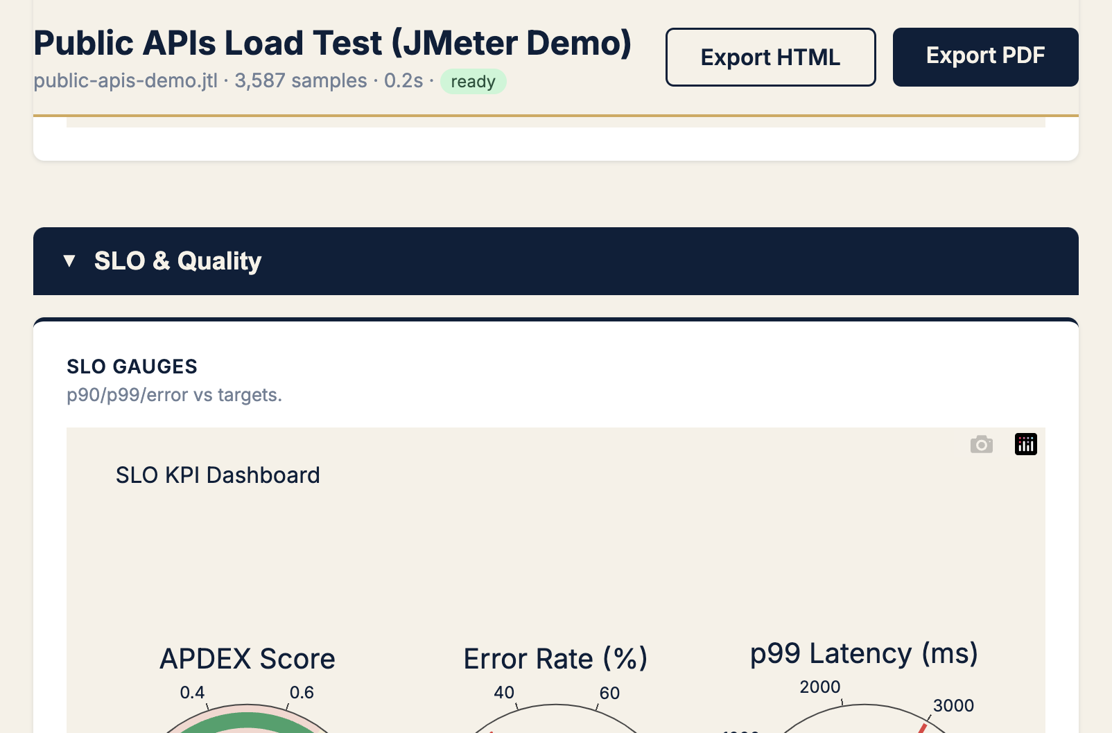
Set T to what your product team considers “snappy” — often 200–300 ms for API calls, higher for complex pages. If Apdex craters while averages look fine, you’re in the P99 trap.
A checklist I use before signing off any load test
I run this mentally (or literally) before I say “we’re good to ship”:
1. Gate on percentiles, not averages
Minimum bar for API load tests:
p50  — typical experience (sanity)
p90  — most users
p99  — tail contract (SLO gate)
max  — investigate outliers, don't gate on it alone
If your CI pipeline only asserts avg < 200 ms, you’re not testing user experience. You’re testing a statistic.
2. Compare tail ratio (p99 ÷ median)
| Tail ratio | My read |
|---|---|
| < 2× | Healthy distribution |
| 2–4× | Watch list — investigate before peak traffic |
| > 4× | Structural tail problem — don’t ship without cause |
The 3.1–3.5× ratios from the bakeoff run landed squarely in watch list territory. Green SLO, yellow instinct.
3. Split by transaction, not just aggregate
Aggregate reports are where tails go to hide. Always break down by:
- Transaction name / label
- HTTP status code
- Time window (did the tail appear mid-test?)
4. Pair latency SLOs with error SLOs
Slow and failing are different problems — but users experience both as “the app is broken.” On another run, 31.7% errors and a FAIL SLO verdict came with a p99 of 1,124 ms. The tail and the error spike were the same story: rate limiting on one endpoint under load.
Gate both. Report both. Don’t let a low average on healthy endpoints mask a catastrophic failure on one label.
5. Write the SLO in user language
Bad: “Average response time under 100 ms”
Better: “99% of checkout API calls complete under 500 ms with less than 0.1% errors”
The second version is testable, shareable, and maps to what product actually cares about.
How to catch the trap in JMeter — without a custom script
You have three practical options, from lightest to fullest:
Option A — JMeter’s aggregate report, read correctly
Open the Aggregate Report listener. Add columns for 90th / 95th / 99th pct. Sort by transaction. Look for rows where pct lines diverge hard from average. This works locally; it doesn’t scale to CI.
Option B — SLO gate inside the test run
Add a Backend Listener that evaluates thresholds when the test finishes — latency percentiles, error rate, throughput — and emits an HTML report with pass/fail verdicts plus anomaly hints. That’s what I built PerfSage SLO Reporter for: the verdict travels with the run, not in a script someone maintains separately.
Option C — Post-run analysis on the JTL
Upload the raw .jtl to PerfSage Reveal for scatter plots, Apdex gauges, tail-ratio callouts, and a shareable PDF. I use this when I need to explain a result to someone who will never open JMeter.
The question I now ask in every review
Instead of “Did we pass?” I ask:
“If I’m user #100 in this traffic slice, what do I feel?”
That reframing catches the P99 trap before production does. Averages are fine for capacity planning. They’re terrible for experience contracts.
Your load test didn’t lie. It just answered the wrong question.
What’s next in Field Notes
This series is where I’ll put the patterns that don’t fit a product launch post — tail latency, CI gate design, chaos/load test pairings, incident retros with numbers attached.
If this resonated, the two posts that set up the tooling behind these examples:
- I Couldn’t Gate JMeter on SLOs — So I Fixed It for Good — the 5-API bakeoff where every check passed and the tails still flagged
- JMeter Gave Me Reports. I Needed Answers — So I Built PerfSage Reveal — scatter charts, Apdex, and the analysis step most teams skip
Try the tools:
- PerfSage SLO Reporter on GitHub — JMeter plugin for SLO gates in CI
- PerfSage Reveal on GitHub — upload a JTL, get tail analysis and shareable reports
- Book a call — if you want help defining percentile SLOs for your stack
Field Notes #1 · Published May 2026 · By Aashish Bajpai