Analysis is a sequence, not a slideshow
Most engineers do this:
- Upload
.jtl - Scroll every tab
- Screenshot whatever looks red
- Still not sure what to fix
What senior perf engineers do:
| Phase | Question | Where in Reveal |
|---|---|---|
| 1 · Orient | Pass or fail? What’s the headline? | KPI summary + SLO gauges |
| 2 · Diagnose | Why — tail, errors, saturation, or noise? | Symptom-specific chart |
| 3 · Decide | Ship, investigate, or re-test? | Checklist + export |
Reveal is built around that flow. Below is the symptom → chart → KPI map I use on every run.
🧭 Quick reference: pick your chart in 10 seconds
| 🔍 You need to know… | 📊 Open this first | 🎯 KPIs to watch |
|---|---|---|
| Did we pass release gates? | Executive summary | SLO verdict · p99 · error rate |
| Are averages hiding pain? | Scatter plot | p99 ÷ median · outlier clusters |
| Did we fail SLO on latency or errors? | SLO gauges + Apdex by label | Apdex · error % · p99 ms |
| Which endpoint broke? | Error sunburst | Error count by label + status code |
| What % of users hit slow responses? | Latency CDF | p90 · p95 · p99 lines |
| Which transaction has spread/outliers? | Boxplot per label | Whiskers · outlier dots |
| Is performance flaky vs consistently slow? | CV + IQR outlier scatter | CV by label · IQR fences |
| Are we hitting throughput ceiling? | RT vs throughput | p90 at knee · req/s plateau |
| Does latency jitter under fixed load? | RT vs concurrency | p90 band width at steady threads |
| Server slow or network slow? | Latency components | Connect · TTFB · transfer |
| Fast failures vs slow successes? | RT by status | Success cloud vs error baseline |
| At what load do errors start? | Threads vs errors heatmap | Error rate bucket at thread count |
| Which metrics move together? | Correlation matrix | Pearson r (spot red herrings) |
| Explain to PM / dev in prose | AI analysis (optional) | Narrative + flagged anomalies |
Phase 1 · Orient — start at the summary (always)
Before any deep chart, I need one screen that answers: samples, verdict, headline percentiles, auto-flagged issues.
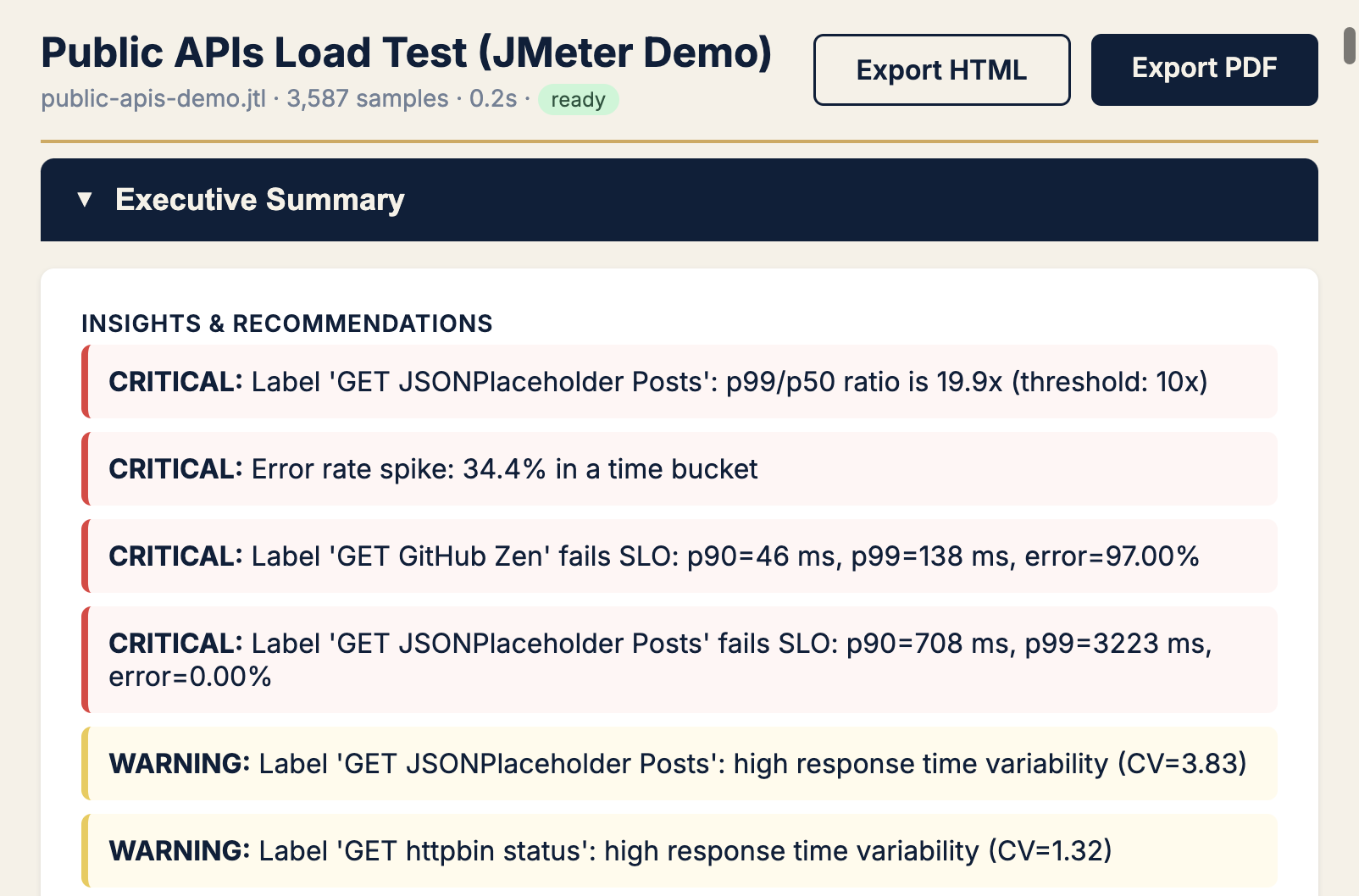
Pattern: If recommendations mention tail ratio, errors, or variability — jump to that section below. If green across the board, still check tail ratio (Field Notes #1).
Pattern A · “Users say it’s slow” — tail latency
Symptom
Stand-up says latency is fine. Product says checkout feels sluggish. Average looks polite.
Chart → Response time scatter
KPIs → p99, p99 ÷ median, outlier clusters
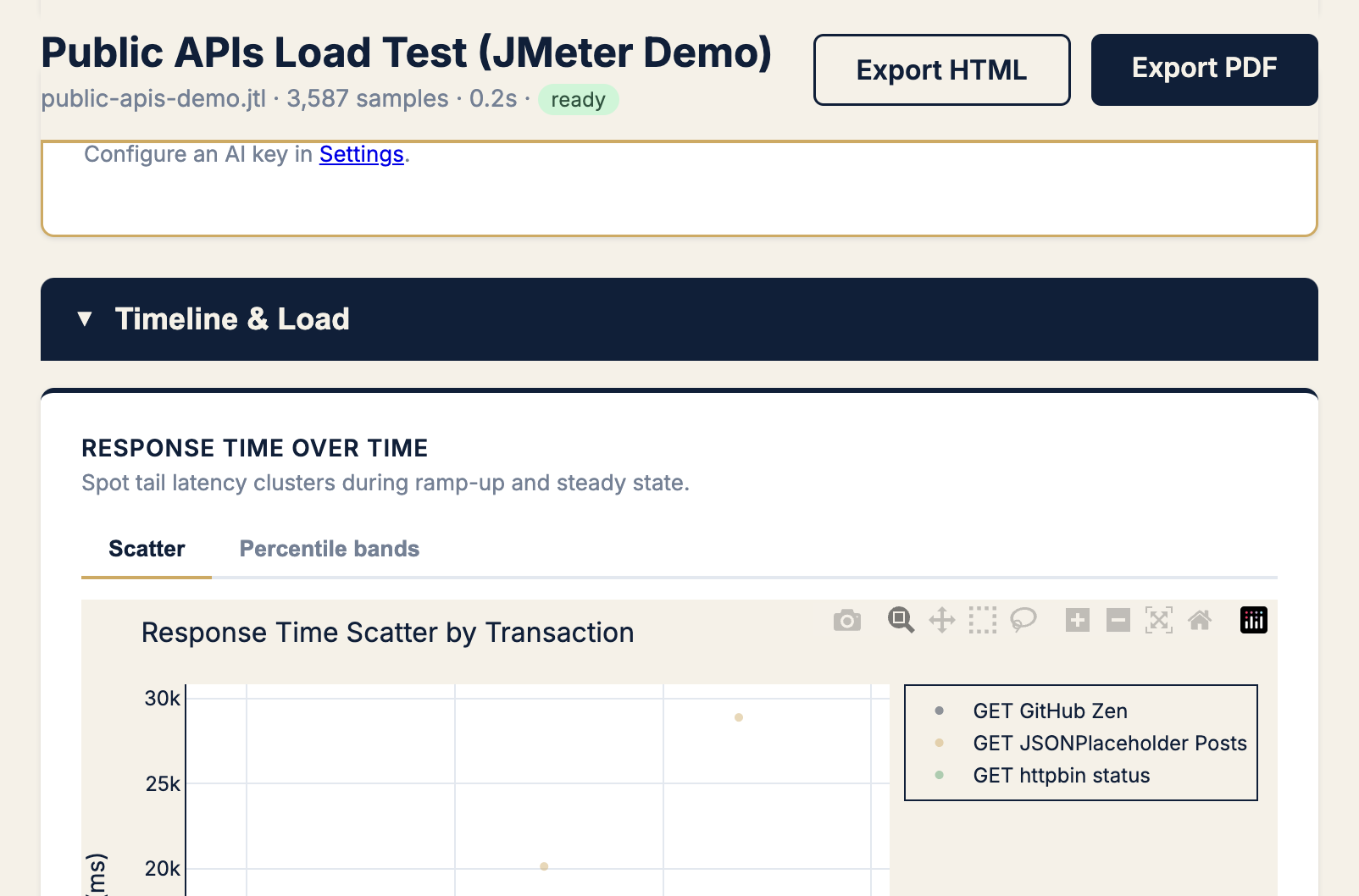
Next moves:
- Note which label owns the upper cloud
- Check when it starts (ramp vs steady state)
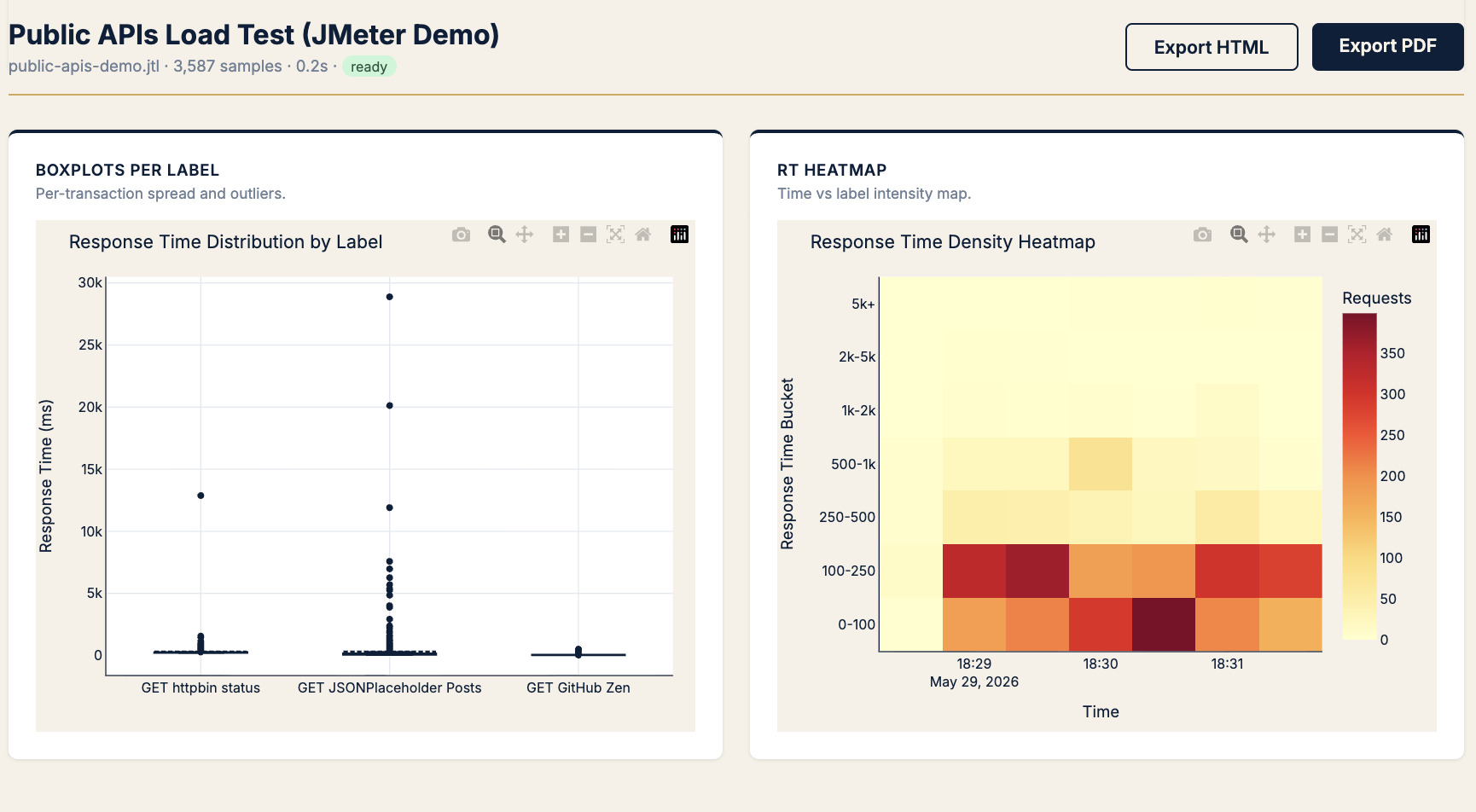
- Open boxplot per label to quantify spread
Pattern B · “Did we pass SLO?” — gates and the Apdex paradox
Symptom
Need a release yes/no. Stakeholders want red/green, not percentiles lecture.
Chart → SLO gauges + Apdex by label
KPIs → SLO verdict, error rate %, Apdex, p99 ms
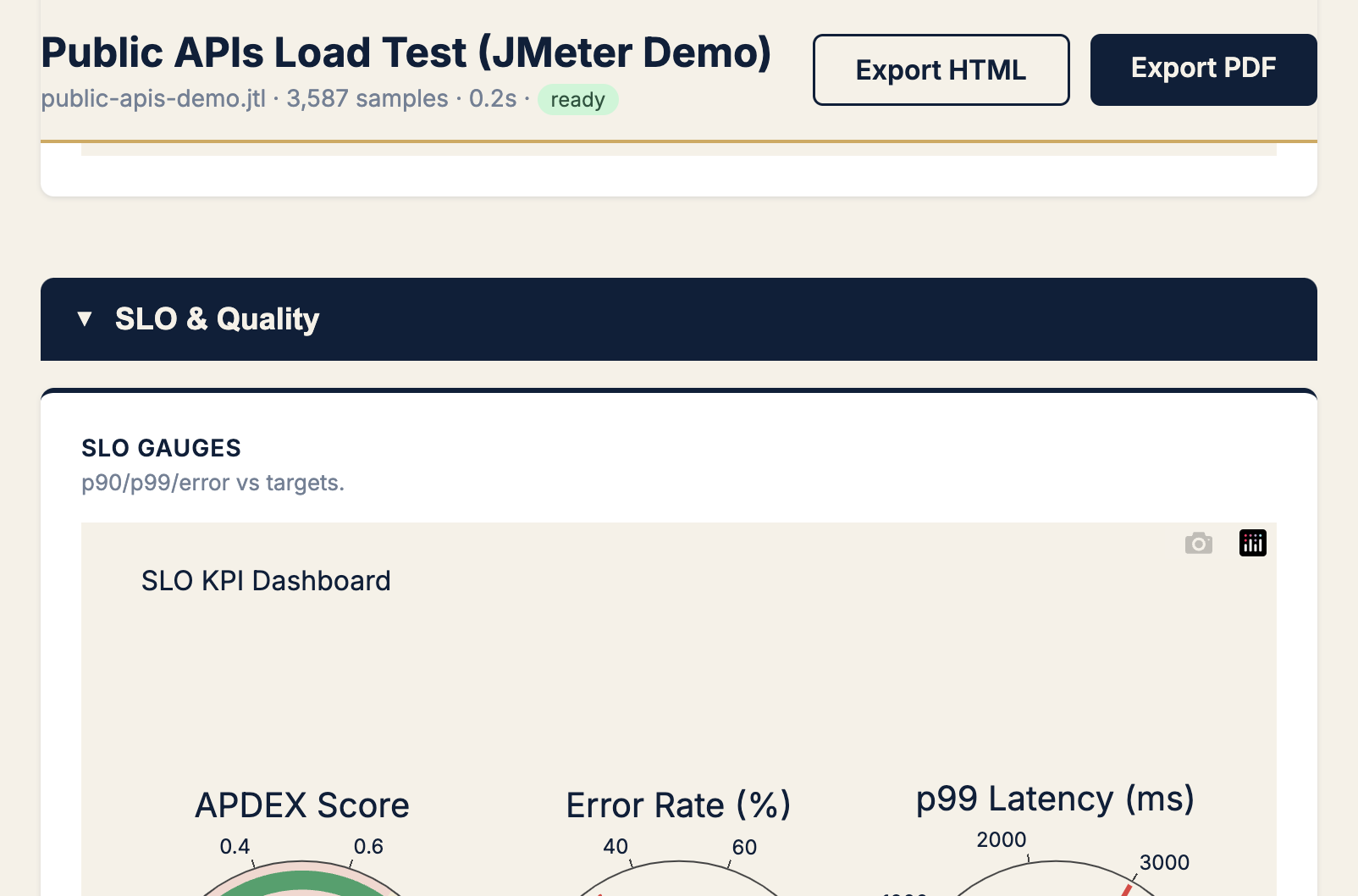
When to use Apdex: translating tail latency for PMs (“12% frustrated” beats “p99 = 480 ms”).
When to ignore Apdex: error rate is elevated — fix availability first.
Pattern C · “Something broke” — errors
Symptom
Error rate > 0. Need endpoint + status code in under a minute.
Chart → Error sunburst (+ errors over time)
KPIs → error rate %, count by HTTP code, label ownership
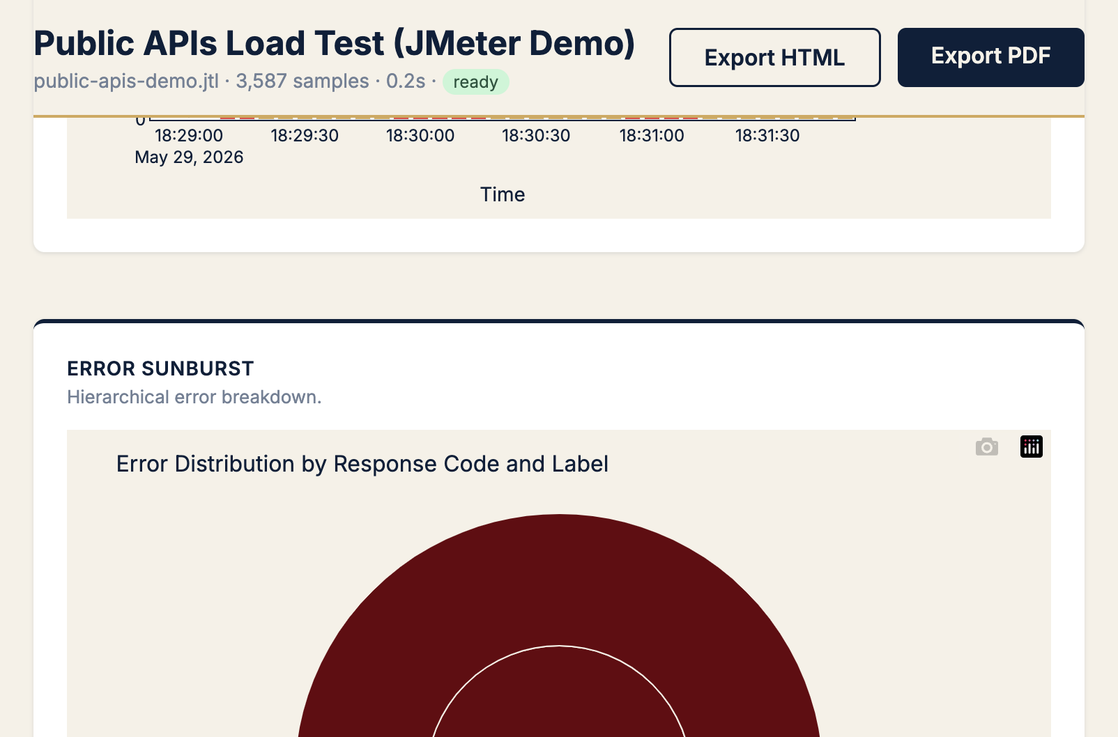
Pattern: Timeline shows when errors spiked; sunburst shows where. In this demo, the fix is test design (public API limits), not server tuning.
Pattern D · “Define or validate SLO thresholds” — distribution shape
Symptom
Product asks “is 500 ms p99 realistic?” You need the full distribution, not a gut feel.
Chart → Histogram + CDF
KPIs → p90, p95, p99 (CDF lines)
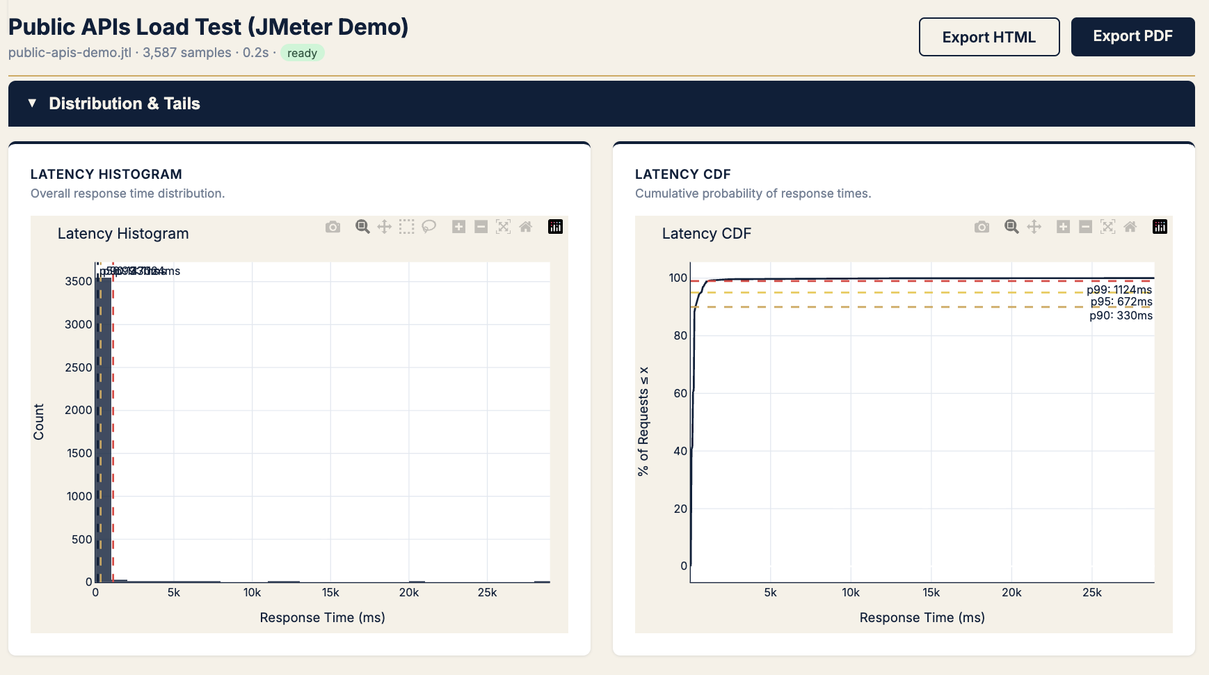
Rule: Set SLOs from CDF, defend them with histogram (proves outliers exist).
Pattern E · “It feels random” — variability and outliers
Symptom
“Sometimes fast, sometimes awful.” Same endpoint, inconsistent experience.
Chart → IQR outlier scatter + CV chart
KPIs → CV (std/mean), outliers beyond 1.5× IQR
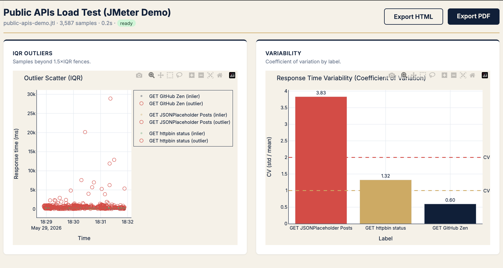
| CV | Read |
|---|---|
| < 1.0 | Predictable |
| 1.0 – 2.0 | Watch |
| > 2.0 | Flaky — investigate before peak |
Pattern F · “How much headroom?” — saturation
Symptom
Planning capacity. Need the knee where throughput stops climbing and latency spikes.
Chart → RT vs throughput + RT vs concurrency
KPIs → p90 at plateau, req/s at knee, jitter width
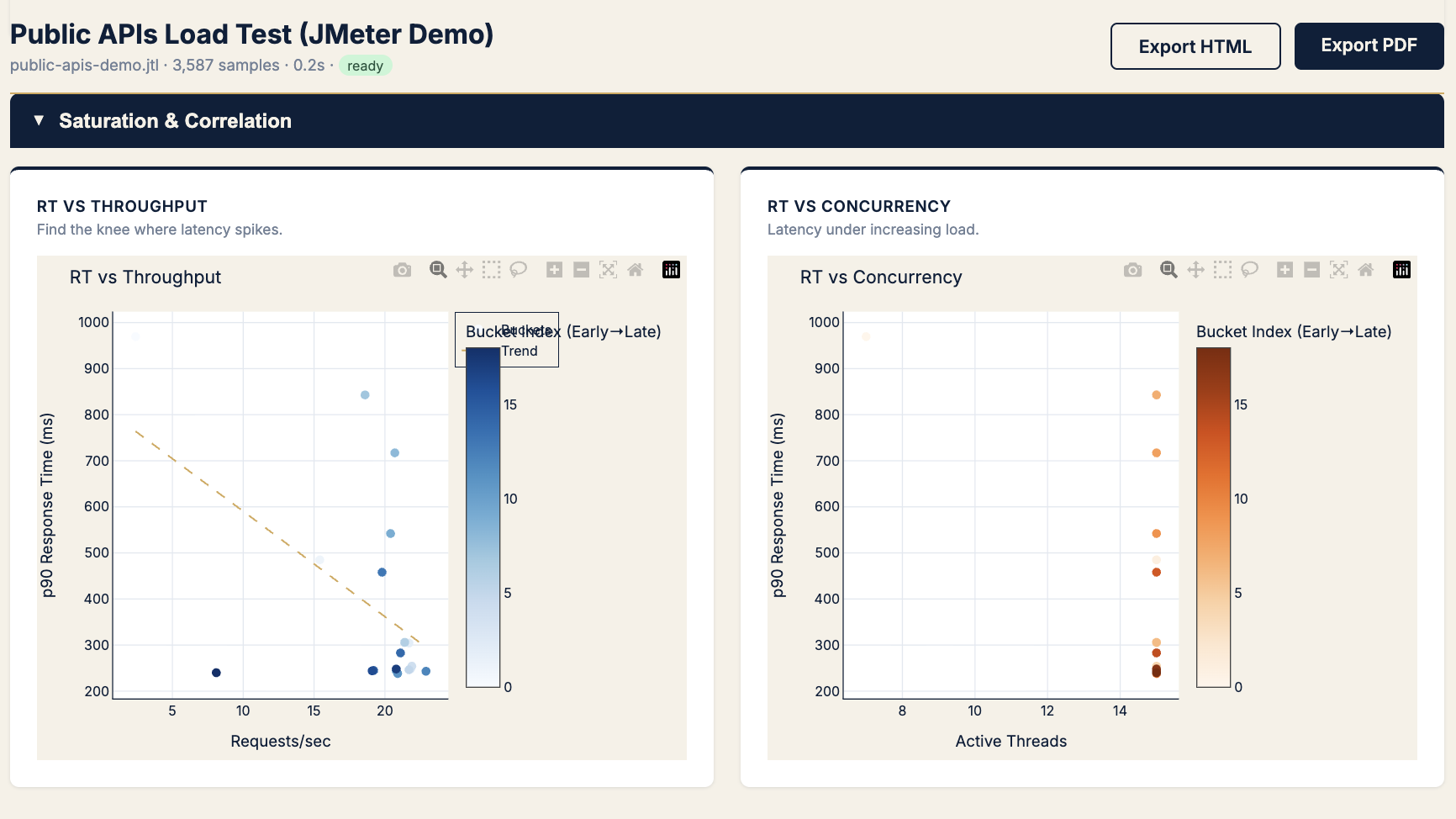
Use before: Black Friday, launch day, autoscaling tuning.
Pattern G · “Network or server?” — latency decomposition
Symptom
Latency regressed but errors are zero. Is it backend processing or connection overhead?
Chart → Latency components + RT by status
KPIs → TTFB, connect time, transfer time
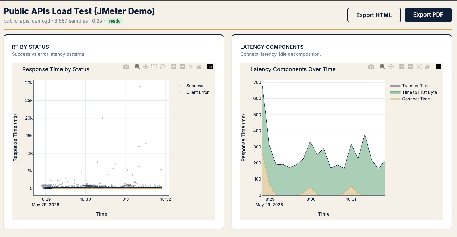
Pattern: Fat TTFB → server/processing. Fat connect → pool/cold start. Fat transfer → payload/size (rare on APIs).
Pattern H · “When do we break?” — load threshold
Symptom
“How many concurrent users until errors?” Need the breaking point, not average error rate.
Chart → Threads vs errors heatmap
KPIs → error rate bucket at thread range
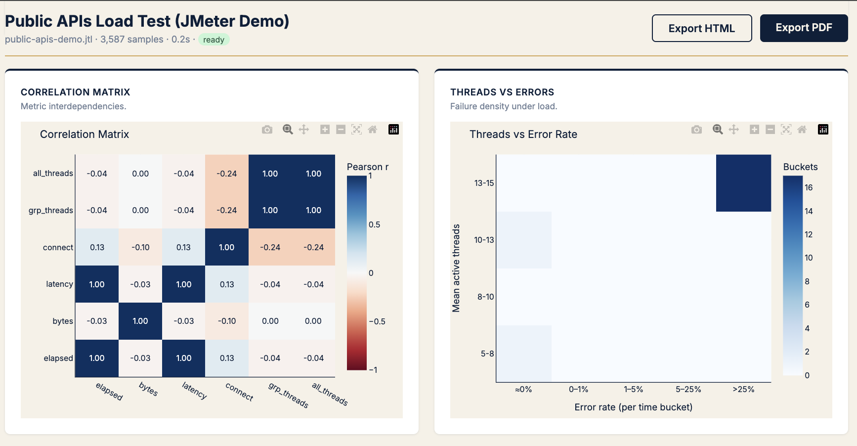
Use the correlation matrix beside it to kill red herrings (e.g. bytes ↔ latency ≈ 0 → payload size isn’t your problem).
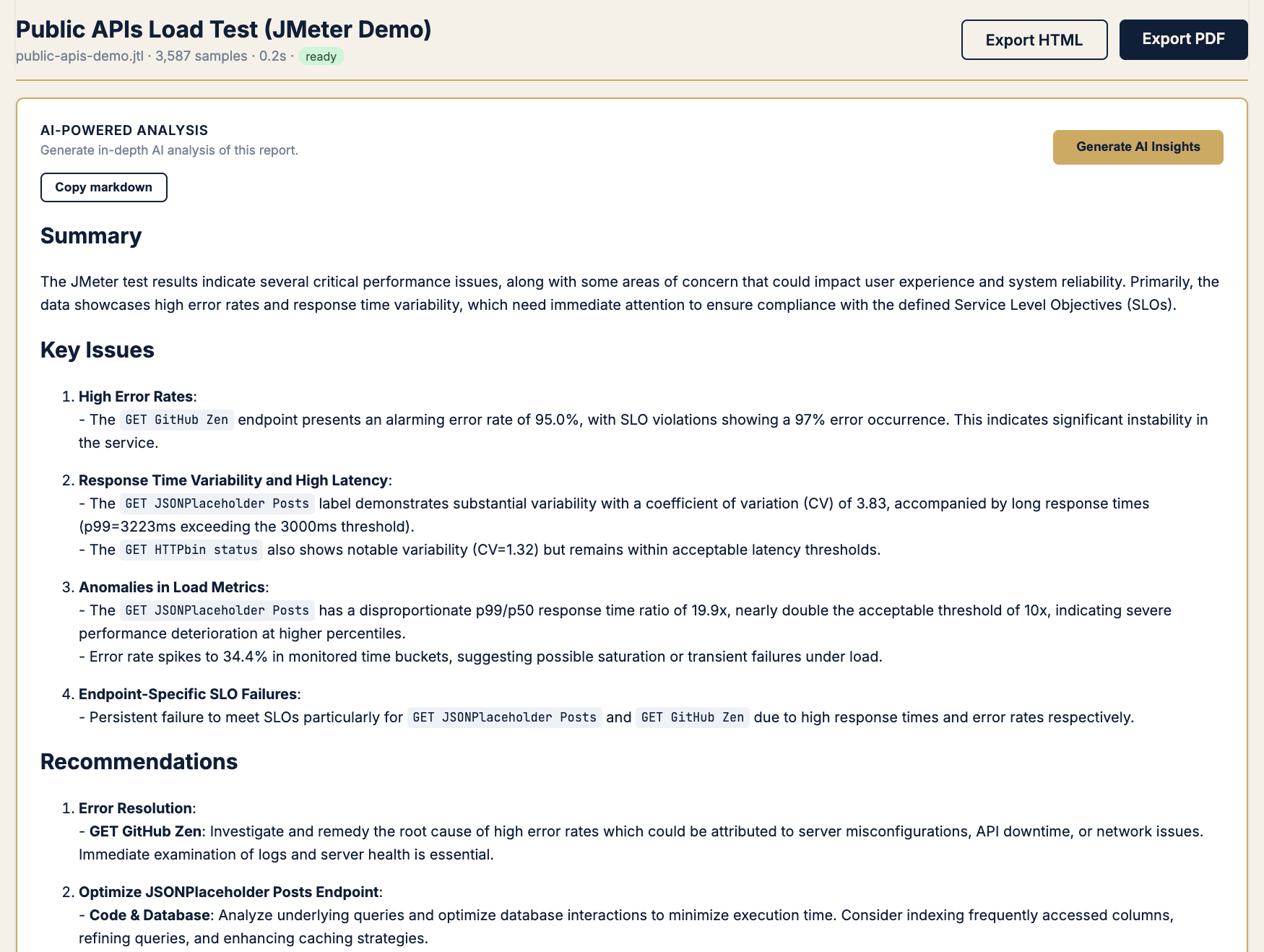
Pattern I · “Explain it to someone who wasn’t in the war room”
Symptom
Dev needs prose. PM needs a PDF. You need sleep.
Chart → AI-powered analysis (optional, your API key)
KPIs → Same math as above — AI narrates, never decides
The 5-minute analysis workflow (copy this)
1. Upload .jtl → read executive summary (verdict + recommendations)
2. If errors > target → sunburst → label + status code
3. If SLO fail on latency → scatter → boxplot → CDF
4. If "flaky" gut feel → CV chart + IQR scatter
5. If capacity question → RT vs throughput/concurrency
6. Export PDF → attach to PR / ticket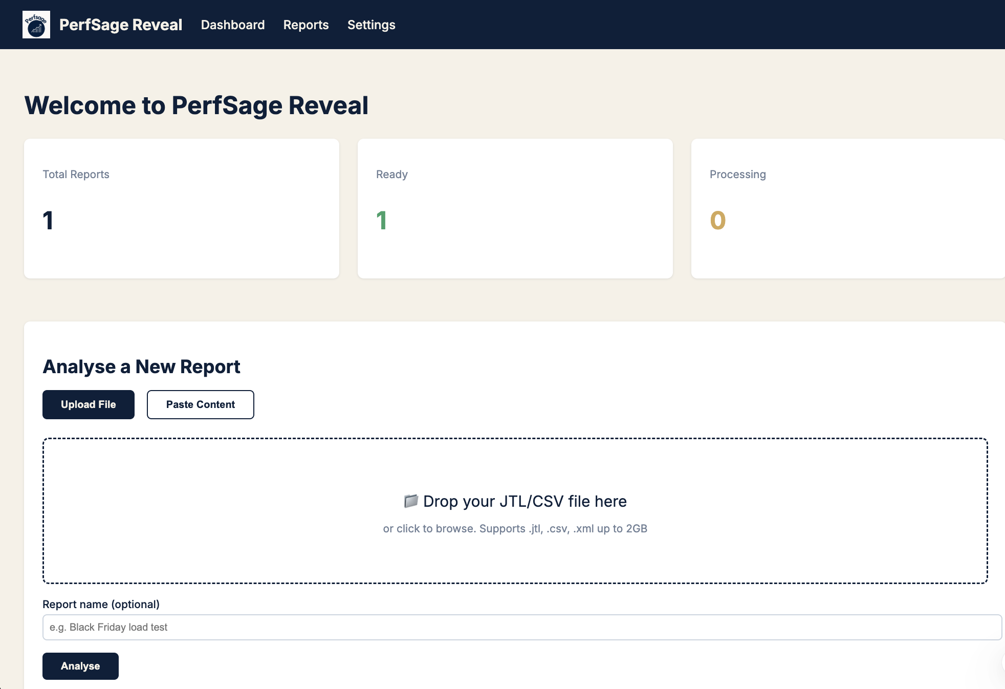
Which KPI for which situation (cheat sheet)
| Situation | Primary KPI | Secondary KPI | Chart |
|---|---|---|---|
| Release gate | SLO pass/fail | p99, error % | Summary + gauges |
| User feels slow, avg OK | p99 ÷ median | p99 ms | Scatter |
| Stakeholder comms | Apdex | % frustrated (derived) | SLO gauges |
| Incident: what broke | Error rate by label | HTTP code | Sunburst |
| SLO negotiation | p99 on CDF | p95 buffer | Histogram/CDF |
| Flaky endpoint | CV | IQR outlier count | Variability |
| Capacity plan | req/s at knee | p90 at knee | RT vs throughput |
| Backend vs network | TTFB share | Connect spike | Latency components |
| Breaking point | Error % at thread N | — | Threads vs errors |
Try it on your last JTL
docker pull aashu3201/reveal:latest

docker run -d \
  --name perfsage-reveal \
  -p 8000:8000 \
  -v perfsage-reveal-data:/app/data \
  -e PERFSAGE_SECRET="change-me-to-a-32-char-random-string" \
  aashu3201/reveal:latest
Open http://localhost:8000, upload any .jtl, and run this playbook against your own run.
- GitHub: github.com/perfsage/reveal
- Launch story: JMeter Gave Me Reports. I Needed Answers
- Tail latency deep dive: The P99 Trap
- Book a call: topmate.io/abajpai
Field Notes #2 · Published June 2026 · By Aashish Bajpai